BRABO
An identity for India's first indigenous articulated industrial robot, designed with Tata Elxsi for TAL Manufacturing Solutions.
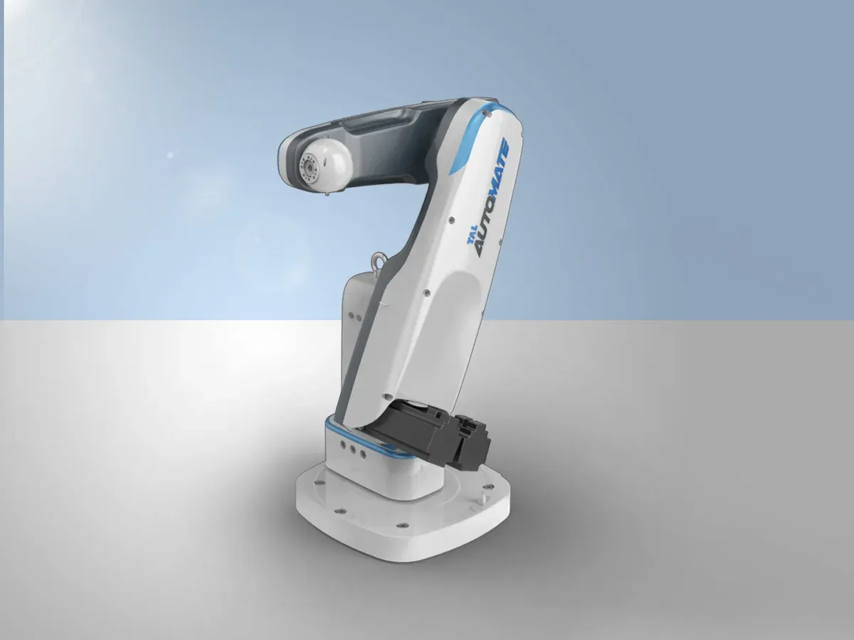
- 5 axisArticulated arm, 5 kg and 2 kg capacity
- 5 monthsProject durationAs stated in the deck
- Press coverageAuto Tech Review, The Economic Times and DNAAs listed in the deck
On this page
Giving a new kind of machine a face
TAL Manufacturing Solutions, a Tata company, was bringing its first indigenous articulated industrial robot to market. The brief was an identity: a look that separates it from the competition and says what it is.
I worked on this as part of the Tata Elxsi design team. The deck describes it as an identity for an advanced technology: clean and distinct, well engineered to reduce weight and perform without a break, and reflecting the spirit of the Tata brand.
One robot, many workplaces
What the robot is
- A 5-axis arm with 5 kg and 2 kg capacity.
- Aimed at micro, small and medium enterprises that need cost-effective robotics.
- India's first indigenous articulated industrial robot.
Where it works
- Medical.
- Heavy manufacturing.
- Welding.
- Assembly, packaging and more.
What the competition looks like
Show the processCompetitors
I studied how five robot makers present themselves: brand values, product styling, colours and finishes. The aim was to find a place of our own.
Three attributes
Show the processAttributes
Chosen from emerging trends, the product category and market research. Fluidic is about product motion, futuristic is the emerging trend, and bio-inspired is the emotional value of an extended arm.
From sketches to shapes
Show the processIdeation
Three decisions that shaped it
What we chose, and what each choice cost.
An identity from motion, trend and feeling
- What we chose
- Fluidic, futuristic and bio-inspired as the three attributes.
- What it cost
- A sculpted form still had to be lightweight and manufacturable, since the engineering aim was low weight without compromising the core.
Concept 2, called Spittor
- What we chose
- After concept validation and manufacturing feasibility, concept 2 was chosen for development.
- What it cost
- Two other directions were set aside.
- What followed
- Colours and finishes followed the Tata brand values and product trends. The working name Automate became BRABO.
Colour as a way to tell applications apart
- What we chose
- Colours and finishes that separate the applications and tell the brand story.
- What it cost
- One identity had to hold across medical, welding, assembly and packaging, so it stayed clean and quiet.
Concepts and the chosen form
The original product, the concept that was chosen, and the proposals. Press an image to open it full size.
BRABO
On the show floor
Show the processIn the market
A press clipping, the TAL stand and the robot at work, from the deck.
What I took from it
What this taught me about the product
People hand real work to a robot, and its shape is the first thing that tells them what to expect.
- A clean, light form says precision before anyone reads a spec.
- The identity had to work for a hospital and a welding shop, so it asked for restraint, not decoration.