Fortum global app
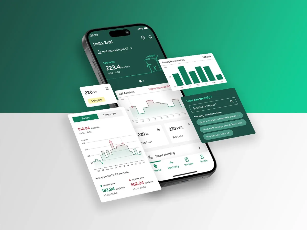
One app for Sweden, Finland and Norway, with live prices, smart charging and a shared design system.
- 92%Customer satisfactionWeb and app combined
- 39%Conversion
- -18%Drop-offFewer people leaving mid-flow
- 39%EngagementIncrease
Figures as reported by the programme.
On this page
One app instead of several
Fortum ran separate mobile apps in different countries, plus extra stand-alone apps for smart services. The new global app brings every product and service into one place: real-time electricity data, in-app product sales, smart charging and smart heating, and insights that help people plan around what their electricity costs.
I led the harmonisation as senior designer, from inception to MVP launch. That covered research, design, stakeholder management, value creation, validation, and alignment with the logged-in and open web platforms. I worked with three junior designers and the development teams, alongside a lead service designer, UI designers, testers, tech leads and an architect. Stakeholders came from Fortum, Telge Energi and NorgesEnergi, whose app I had worked on before this.
Several apps, one confused customer
What was happening
- Fragmented experience. Several regional apps showed similar information in different ways.
- Churn. Stand-alone apps for smart services made the journey worse, and people left for more joined-up options.
- New expectations. People now want live prices and consumption tracking in one place, not only invoices.
The opportunity
- One platform for all regions.
- Retention through smart services that are worth opening the app for.
- Scale. Standard processes and data handling across markets.
People wanted to see their use, live
We ran 11 stakeholder interviews, 3 surveys with 376 respondents and 73 user interviews, 23 in person and 50 remote, across Sweden, Finland and Norway. Participants were 18 to 60 and included people with disabilities and people who use smart energy at home.
82% wanted a live overview of daily usage
60% wanted daily insights and tips
55% wanted one solution for all electricity needs and bills
41% of EV and electric-heating users wanted help managing it automatically
Four pain points
Apps felt complex and not smart. Invoices and estimates were unclear. And daily monitoring when prices are high was emotionally taxing.
Four kinds of customer
Show the processFour segments
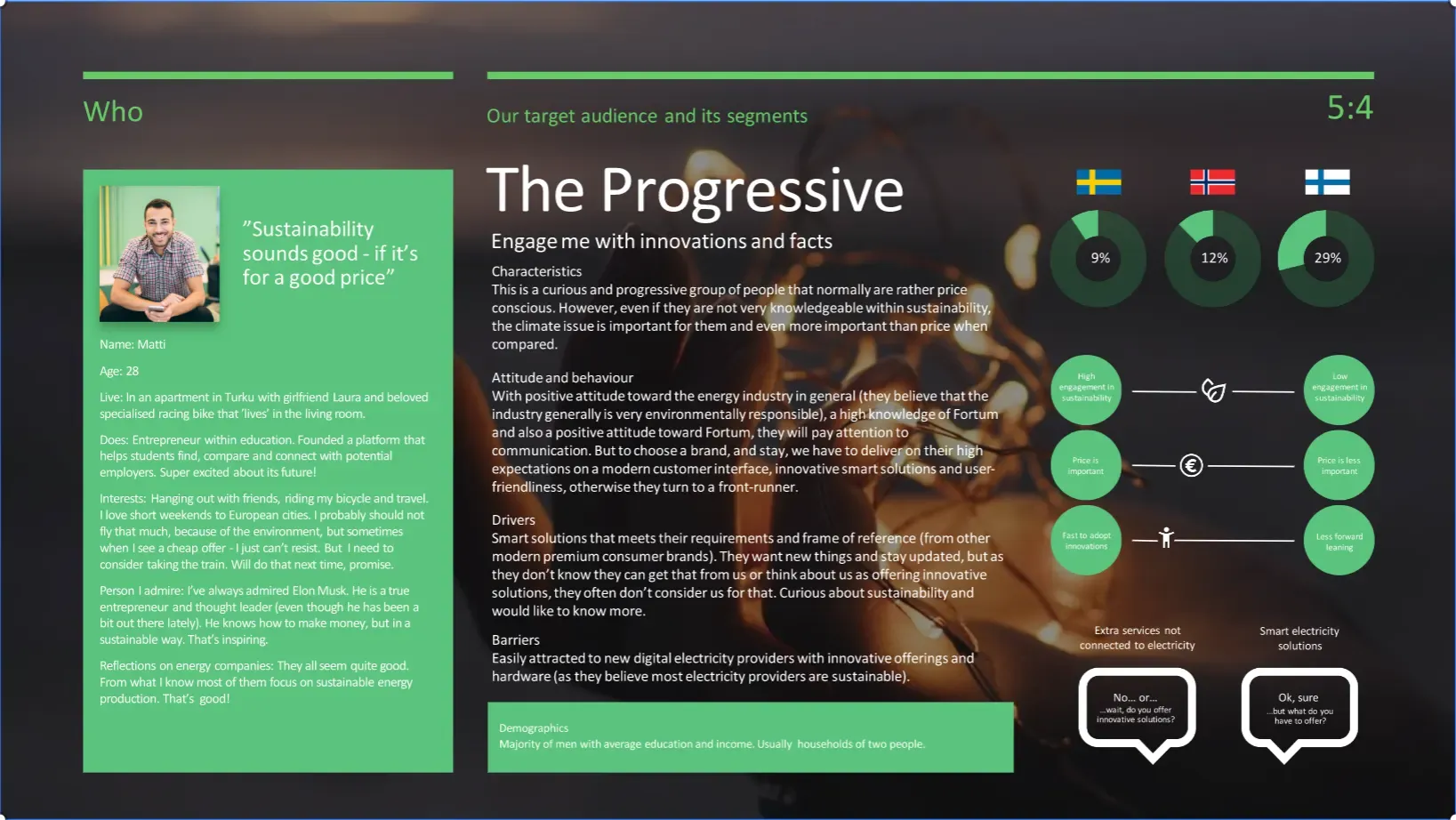
Built with stakeholders from the research. Choose one to see its slide.
The Progressive
Engage me with innovations and facts
The Informed
Show me proofs and progress and I'll trust you
The Green
Make it easy for me to join the change
The Open-minded
Give me peace of mind, and extra services
Five steps, repeated
Show the processDesign journey
Pick a step to see what I did on Fortum.
73user interviews, plus 376 survey responses and 11 stakeholder interviews
Interviews and surveys in Sweden, Finland and Norway, 23 of the interviews in person. I also followed app store reviews and community threads such as Reddit, Facebook and Twitter.
- Interviews
- Surveys
- Observations
- Competitive audits
- Feature matrix
4customer segments built with stakeholders
Segments and personas, a journey from finding a product to after-sales, a stakeholder workshop, user story mapping and a value-proposition matrix that set the cut for the first release.
- Empathy maps
- Personas
- Journey map
- User flow
- Storyboards
- Value proposition
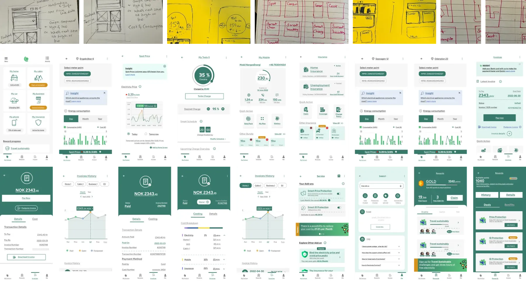
After early usability tests, the research and the business needs, we began building the MVP: brainstorming, user flows, information architecture, then paper sketches and wireframes.
- Brainstorm
- Information architecture
- Paper sketches
- Paper wireframes
2concepts, built on Fortum's existing design system
We reused Fortum's design system and made several components work mobile-first, then built two concepts for testing.
- Digital wireframes
- Low fidelity
- Style guide
- High fidelity
8.9out of 10 in the Stockholm usability study
Concept tests with 15 participants, then a moderated study with 7 users on iOS and Android. Then we refined, and repeated.
- Usability study
- Affinity mapping
- Insights
- Refine
Testing changed six things
Two concepts went to 15 participants across the three countries and scored 8 and 9 out of 10. The feedback was specific, and we acted on all of it:
- Simplify the home screen
- Add context to every figure, with titles and periods
- Use red for high prices and green for low ones
- Plan for large fonts and screen readers from the start
- Show a total amount due across contracts
- Make historical data easy to reach
The colour rule, tried
Move the alert, see what counts as low
One of the findings was to show high prices in red and low ones in green. Illustrative prices, not real data.
Four decisions that shaped it
The choices that carried the most weight, and what each one cost.
One app, not one per country
- What we chose
- Bring every product and service into one app for Sweden, Finland and Norway, on a shared design system.
- What it cost
- Regional differences gave way to shared processes and data handling, and three sets of stakeholders had to agree on one design.
- What followed
- The redesigned apps were announced in September 2024, with the rollout starting in Sweden.
A home screen that follows the contract
- What we chose
- The top carousel changes with the contract and smart actions: spot-price customers see live prices, and when a car is plugged in it shows a charging overview.
- What it cost
- The home screen has more states to design and to keep consistent across contracts.
- What followed
- Testing asked us to simplify the home screen and to show a total amount due across contracts.
Red for high prices, green for low
- What we chose
- Colour the daily price chart so cheap and expensive hours read at a glance.
- What it cost
- Colour alone leaves some people out, so every figure also carries a title and a period, and we planned for large fonts and screen readers from the start.
- What followed
- A third party audited accessibility against WCAG 2.2 AA, and we fixed the findings.
Smart charging inside the app
- What we chose
- Build smart charging into the app rather than leave it in a stand-alone one.
- What it cost
- Charging control now sits beside prices and invoices, so it had to stay simple: a plan, live spot prices and estimated values.
- What followed
- 41% of EV and electric-heating users wanted help managing it automatically.
What shipped, and why each part is there
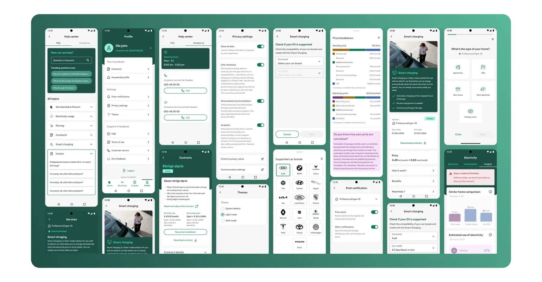
The MVP has four areas: Overview, Energy, Invoice and Profile, with smart charging inside the app. Sign-up and login use email and BankID, and the app has light and dark modes in Swedish, Finnish and Norwegian. Each screen carries the reasoning from the original design presentation: tap a number to read it.
Bird's Eye View
Utility apps can be overwhelming with their complex data and scattered information. We simplify the experience with a clear home screen, a straightforward daily price graph, and one-tap access to all essential information, making utility management both intuitive and efficient.
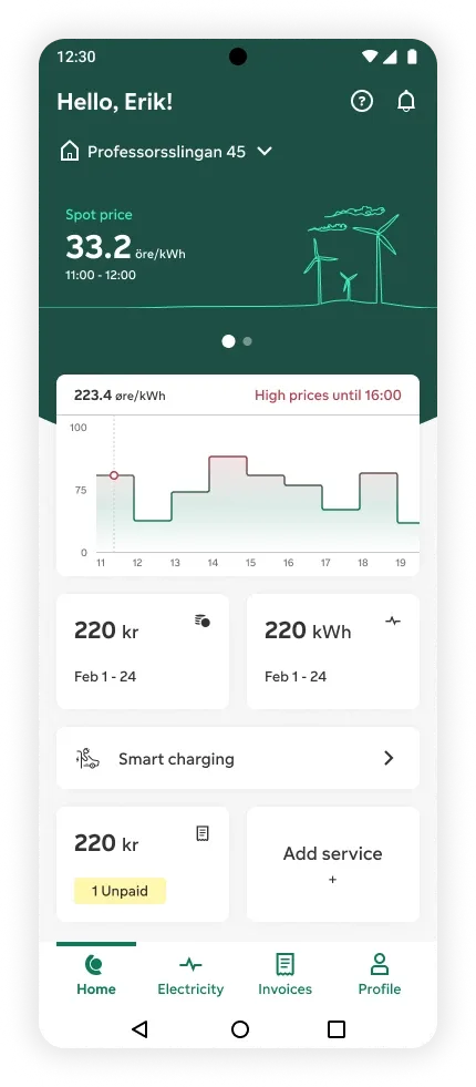
The top carousel showcases the most crucial information, dynamically adjusting based on your contract and smart actions. Spot price customers see live spot prices, and when a car is plugged in, the display shifts to provide a comprehensive charging overview.
Users can seamlessly switch between addresses to access relevant data faster, based on intuitive design inspired by common user behaviours in other apps, reducing cognitive load.
Components are designed with modularity in mind, optimized for rapid development and swift implementation of changes. This approach significantly reduces development time while ensuring each component is thoroughly tested for functionality and usability.
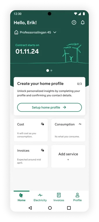
Home for all. We designed the bird's-eye view to accommodate various user scenarios, ensuring that even new customers with no prior experience feel welcomed and informed throughout. This is the new user with a new contract.
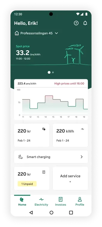
Home for all. This is the home screen for users with a spot price contract.
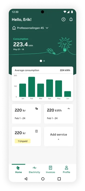
Home for all. This is the home screen for users with a fixed price contract.
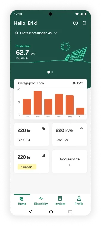
Home for all. This is the home screen for a production site.
What we were solving
How we approached it
Detail Detective
Electricity screen simplifies complex data with intuitive, color-coded graphs and actionable insights. Users can easily compare consumption, prices, and temperatures, making electricity management straightforward and engaging. This user-friendly design enhances satisfaction and promotes energy efficiency, benefiting both users and our business.
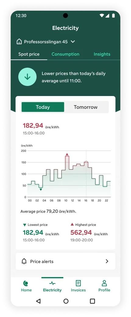
Detailed information and insights about an address are consolidated in one place for quicker navigation.
Highlighted insights on daily prices are highly appreciated.
Easily find prices with interactive graphs, and access next-day forecasts for better management.
Daily highest and lowest price hours are highlighted for easy screen reading and for users who find graphs challenging.
Choose to receive daily alerts on high and low price tides.
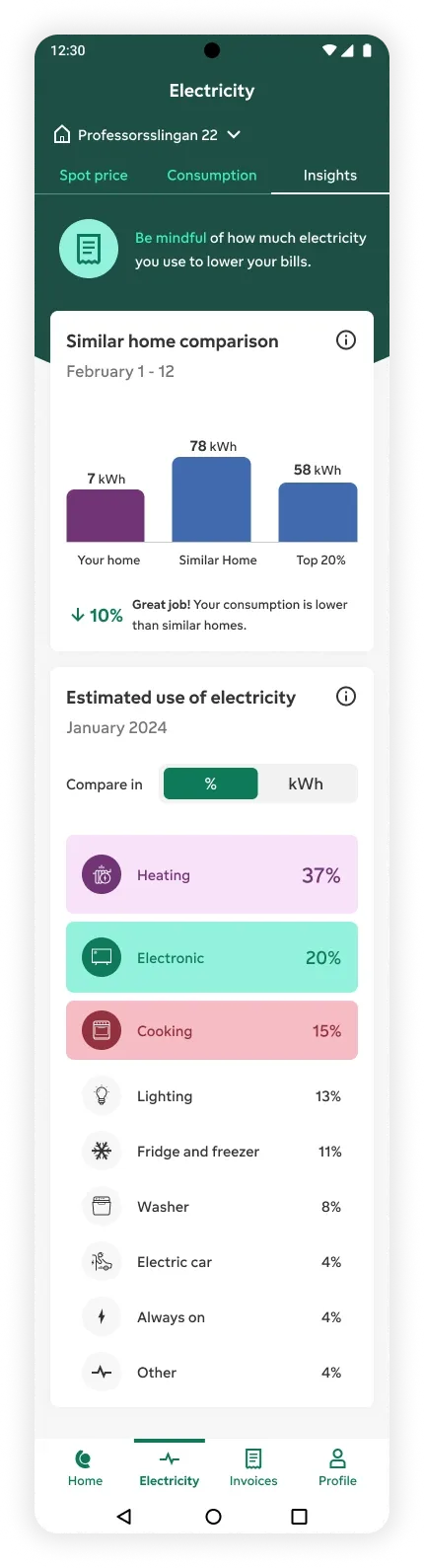
Provides guidance that helps users understand and learn more about electricity.
Once the home profile is set, users can estimate their efficiency compared to similar houses nearby, which motivates and engages them.
Provides insights into energy distribution to help users manage their consumption.
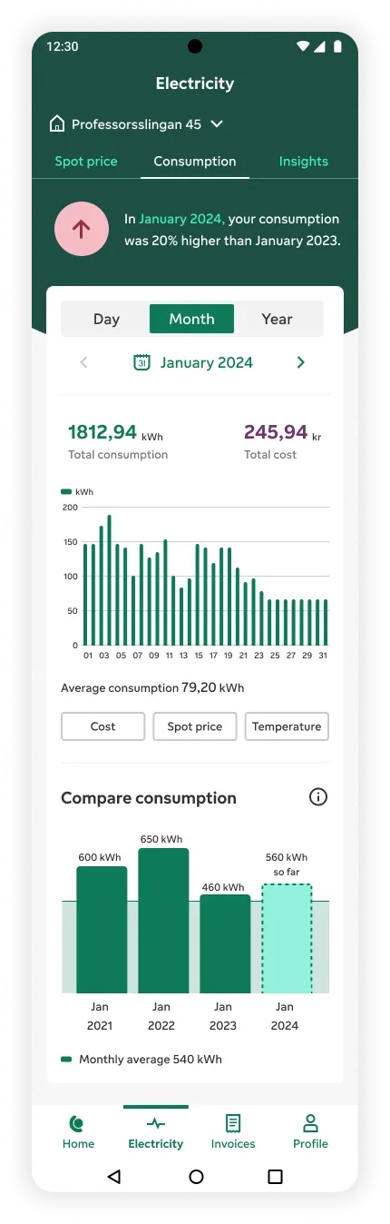
Compare current usage with the same period last year to track your progress and see how you're performing.
Provides an in-depth view of daily usage, with additional comparison features to analyze against prices, costs, and temperatures.
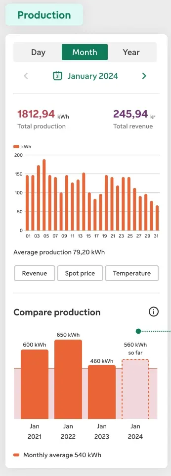
Compare current month's usage with past months to better manage expenses and consumption.
What we were solving
How we approached it
Money Matters
The Invoice screen prioritizes unpaid and new invoices for quick access, with past invoice history easily available. Tapping on invoice cards reveals detailed information, making invoice management clear and straightforward. This design ensures users can efficiently manage their finances and stay on top of their expenses.
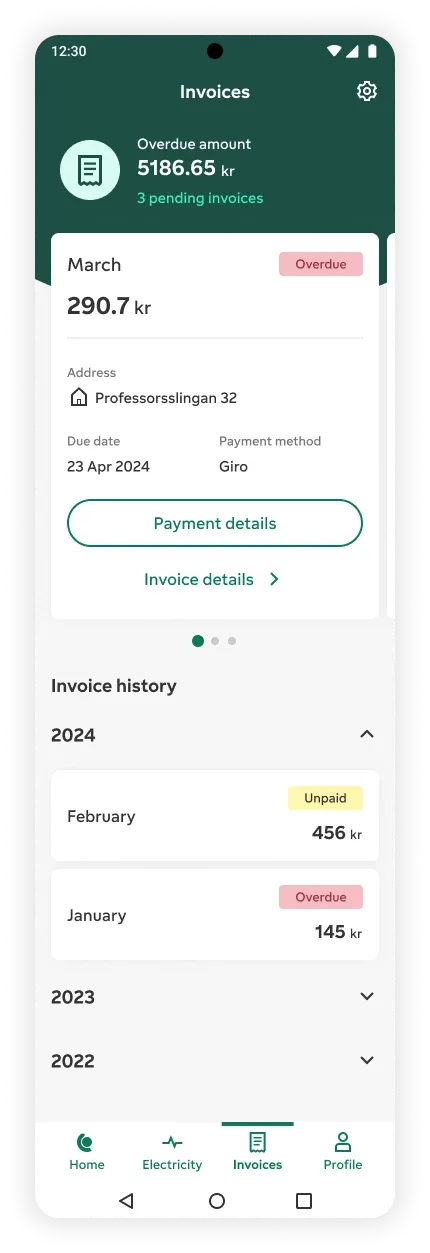
The most appreciated feature of the invoice screen is the clear overview of due amounts. With multiple addresses and invoice contracts, understanding and processing these amounts can be challenging. This feature simplifies the process, making it easier to stay on top of your dues.
A simple overview card condenses complex invoices into an easy-to-understand format, providing users with actionable insights. Essential information such as amount, month, address, and payment details are readily accessible. These cards can be stacked and modified based on the number of addresses and statuses, making them a flexible component.
Historical invoice data is compiled in an accordion format. Each simplified card displays the month, amount, and status, which are the most crucial details for users. Invoice specifics are just a tap away, ensuring all necessary information is easily accessible.
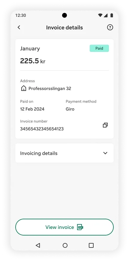
This sub-screen provides users with comprehensive invoice information while maintaining a concise format based on user interaction data. It also serves as a gateway to access detailed PDF invoices, ensuring users have all the necessary details at their fingertips.
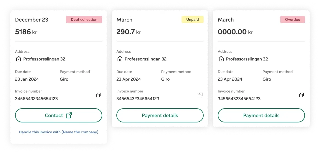
Clear invoice statuses. Each card shows its status upfront, for example debt collection, unpaid and overdue, with the amount, address, due date and payment method.
What we were solving
How we approached it
Feel Smarter
The smart charging feature in our utility app transforms EV management with real-time integration. By consolidating charging functions and providing live consumption and cost insights, it simplifies user experience and reduces reliance on separate apps. Transparent status updates and historical overviews enhance user confidence, while aligning with business goals by improving engagement and efficiency.
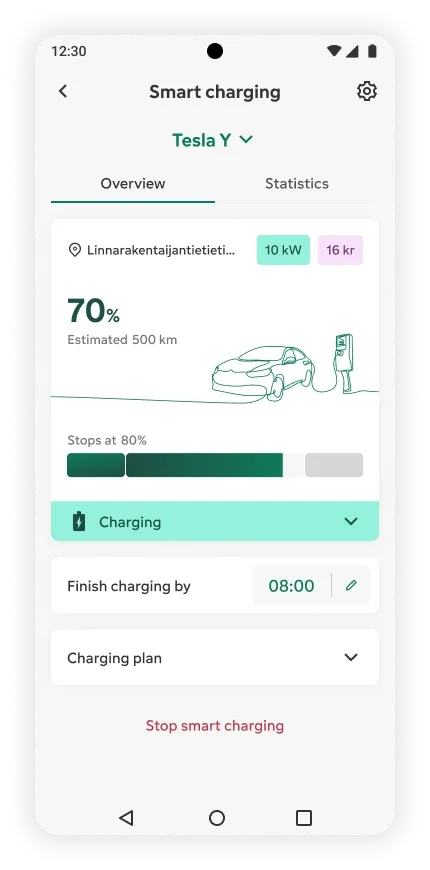
Register multiple cars under the smart charging feature. Selecting a car provides an overview of all registered vehicles with necessary information at a glance.
Color coding simplifies understanding different charging statuses. Expandable details provide more information when needed, ensuring clarity.
The smart charging plan is crafted based on user needs whenever an EV is plugged in for charging. Presented simply, it includes activities and live spot prices for transparency. Estimated values build user trust.
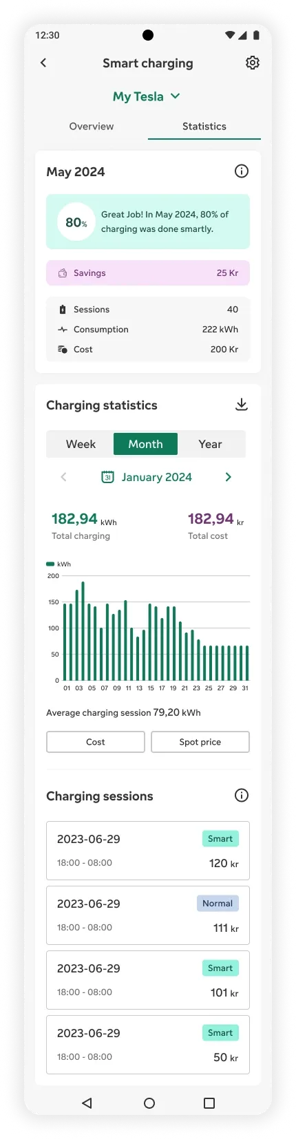
The statistics screen starts with last month's overview, highlighting the percentage of smart charging and user savings, boosting excitement and engagement.
Consistent interactions and visuals with consumption and cost statistics, offering daily details that can be compared with past prices and costs.
Session details include a short overview, savings, plan, duration, amount, and a charging log. Users can see energy usage, costs, and environmental impact. This comprehensive information is downloadable for personal use and helps users track and optimize their charging habits.
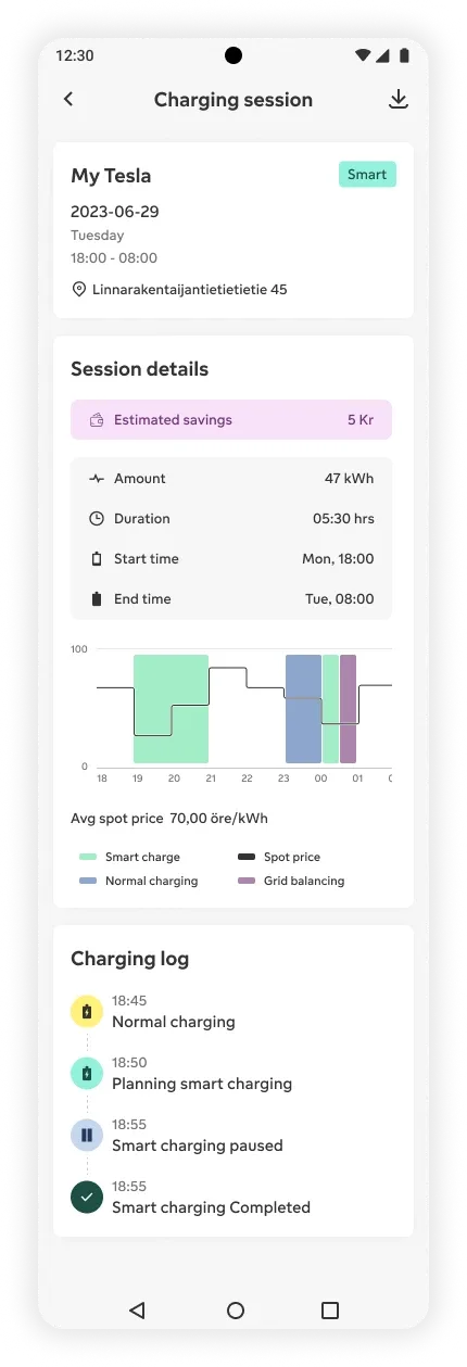
Session in Detail. Session details include a short overview, savings, plan, duration, amount, and a charging log. Users can see energy usage, costs, and environmental impact. This comprehensive information is downloadable for personal use and helps users track and optimize their charging habits.
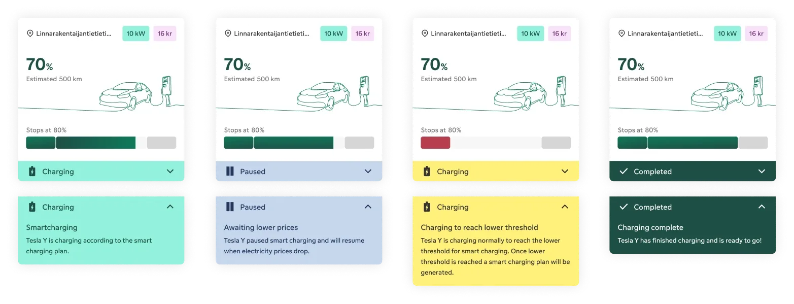
Clear and Crisp Statuses. Four states with colour coding: charging according to the smart plan, paused while awaiting lower prices, charging normally to reach the lower threshold, and charging complete.
What we were solving
How we approached it
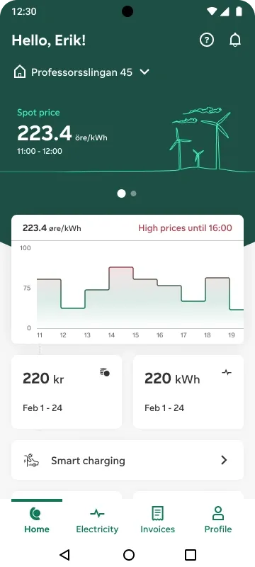
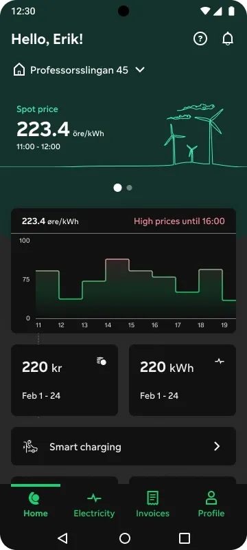
Light and dark
The same screen in two modes
The app ships in both modes. Drag the divider across the same screen, or pick a mode.
Validation: where it scored, where it did not
A moderated usability study in Stockholm with 7 users, on iOS and Android, across spot and fixed contracts. Overall score 8.9 out of 10. The lowest scores were reduced errors (6.4), and brand image and competitive advantage (7.0).
- Optimised navigation9.6
- Information simplicity9.3
- Enhanced UX9.2
- Overall8.9
- Engagement8.8
- Task completion8.5
- Positive emotions8.0
- Functionality7.4
- Consistency across devices7.2
- Competitive advantage7.0
- Positive brand image7.0
- Reduced errors6.4
A third party audited accessibility against WCAG 2.2 AA, and we fixed the findings on text, contrast, target size and screen reader support.
What I took from it
What this taught me about agents
Smart charging asks people to hand a decision to software. The design leans on transparency to make that reasonable.
- The plan is built from the person's needs when the car is plugged in, and shown before anything runs.
- Live spot prices sit beside the plan, so the reason for the timing is visible.
- Estimated values are shown as estimates, because they build trust when people can check them against their bill.
Results
As reported by the programme: customer satisfaction up from 70% to 92% across web and app, conversion from 27% to 39%, drop-off down 18% and engagement up 39%. Fortum announced the redesigned apps in September 2024, with the rollout starting in Sweden.