Car Wizz
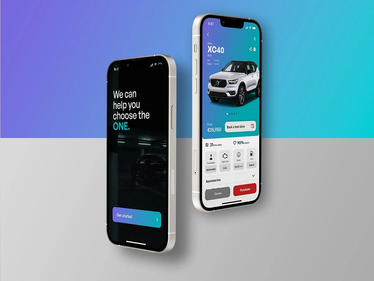
A car-buying app that recommends by personal need, from the first search to the test drive, financing and delivery.
- 6 weeksSolo sprintResearch to prototype
- 5Competitors auditedFour direct, one marketplace
- 29Candidate featuresEleven in the value proposition
- 5Prototype flowsFirst tap to delivery
On this page
A car-buying app that recommends
Car Wizz is a mobile app for buying a car from a dealership. It recommends cars by personal need, then carries the buyer through the test drive, financing, payment and delivery.
The brief was to design an e-commerce app for a car dealership. I worked on it alone over a six-week sprint: user research and a competitive audit first, then user flows, wireframes and prototypes.
The problem
Marko is a tech-heavy and busy executive who needs a recommendation for a reliable second car with the best offer from nearby trusted dealers, because he has limited time to test drive and make the right buying choice for his family.
He gets annoyed when there are too many car options, no reliable information about a trusted dealer, and no clear availability for test driving.
What I set out to learn
Show the processResearch plan
Before any interview I set the goals, the people to talk to, and twelve questions about how people decide on a car.
Interview goals
- Understand the common challenges people face when deciding on a car purchase.
- Identify the frustrations of buying or choosing a car from a dealer.
- Understand where the knowledge behind a choice comes from.
- Understand a car buyer’s challenges in light of their own needs.
Who to talk to
- Ages 18 to 55, living in metropolitan or suburban areas.
- People who buy from dealers, for a first or second car, new or used.
- Different genders, and people with disabilities.
Competitive audit
Show the processCompetitive audit
I audited five car-buying sites in Finland, four direct competitors and one marketplace, on first impressions, interaction, visual design and content. Accessibility was rated poor on all five.
Nettiauto
A direct competitor and a centralised platform for buying cars across the country, for individuals and businesses.
Strengths
- A large database with decent information
- Multiple filters and a comparison option
- Easy navigation and a simple, direct flow
- Direct contact by email
Gaps
- A complicated, information-heavy page with too many options
- No recommendations, and no reviews or ratings for dealers
- No saving options and no payment options
- Very limited accessibility consideration
Kamux
A direct competitor with new and used cars, aimed at medium to high-income segments.
Strengths
- A modern feel with clean, well-distributed information
- Good filters and live chat with an expert
- Trade features
- A strong brand identity
Gaps
- No mobile app
- No comparison or save option
- No built-in payment options or profile management
- Limited languages and accessibility
Delta-Auto
A direct competitor offering new and used cars with better budget value.
Strengths
- Offers and trends on display
- Quick registration with other accounts
- An instalment calculator that makes financing easy to work out
Gaps
- No mobile app
- A long flow to reach the car list, with confusing navigation
- Outdated visuals and no ratings on cars
- One language only
Rinta-Joupin Autoliike
A direct competitor offering comparatively cheaper cars for similar products.
Strengths
- Bold car-category filters on the front page
- A service booking option
- Clear, clean navigation
- Good use of colour and space
Gaps
- No sign-in, profile or save options
- No payment flow and no features for returning users
- No mobile app
- One language only
Tori.fi
An indirect competitor: a marketplace for reselling all kinds of products, cars included, with direct contact to owners.
Strengths
- Filters for items and places
- Easy profile creation
- A simple, direct flow and clear navigation
Gaps
- No review system and no payment option
- Fake advertisements
- Outdated visuals, small and low-contrast fonts
- One language only
Four steps, repeated
Show the processDesign journey
Four steps from the brief to a prototype. Pick one to see what I did.
12interview questions, with goals and target participants defined
I planned interviews around how people decide on a car, what frustrates them with dealers and where their information comes from, and audited five competitors.
- Interviews
- Empathy map
- Competitive audit
The research became a persona, Marko, a busy executive looking for a reliable second car, with user stories, a user journey map and a problem statement.
- User persona
- User stories
- User journey map
- Problem statement
- Hypothesis statement
29candidate features, grouped under five user values
I listed the features that would improve the journey and grouped them under five values: informative, cost and offers, accessible, reliable and after service. Eleven made the value proposition.
- Feature list
- User values
- Value proposition
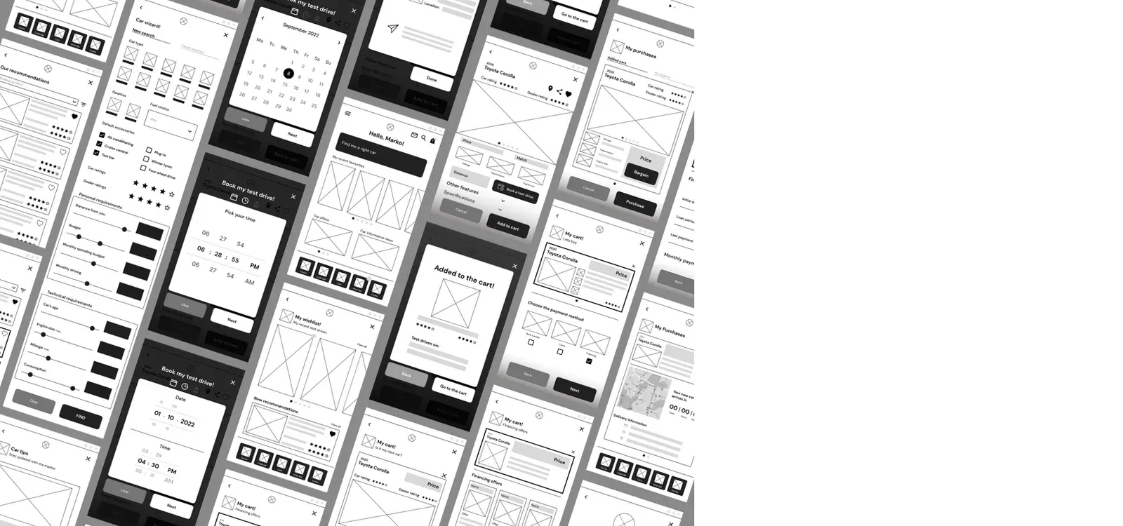
Low-fidelity frames came first, then a high-fidelity prototype in five flows, from the first screen to delivery.
- Low-fidelity prototype
- High-fidelity prototype
Value proposition
Based on the user findings, the persona and the problem statement, these eleven features made the value proposition.
- A single place for notifications across the state, with subscriptions for better offers
- A dashboard for the buyer’s own cars, with details such as the next service
- An online buy option with easy payment
- Better financing offers every day, with an easy swap between financing companies
- Recommendations on nearby cars with offers, based on what the buyer needs
- Test drive booking in the app, with a notification when a new slot is free
- Online documentation saved on the profile, for an easier purchase
- The reliability of a car and a dealer highlighted in every ad
- Profile verification for all users and dealers
- Support and a single contact point for emergencies
- After the purchase, a way to buy insurance, pay taxes and add gadgets
Three decisions behind the flow
The choices that shaped the app, and what each one costs. This is an independent case study, so these are design decisions, not shipped outcomes.
Recommend by need, not by filter
- What we chose
- Ask what the buyer needs first, then recommend cars.
- What it cost
- The buyer answers questions before seeing a single car, which a search box does not ask.
- What followed
- The competitive audit found heavy pages with many options and no recommendations.
Book the test drive inside the flow
- What we chose
- Keep the step from a shortlisted car to a test drive in the same app.
- What it cost
- The app depends on dealer availability being current.
Financing and delivery in the app
- What we chose
- Carry the buyer from the first search through financing to delivery in one place.
- What it cost
- A longer flow to design and to explain, with more places where a buyer could stop.
What is not yet known
This prototype has not been through a usability study.
I audited five competitors and planned twelve interview questions, then designed and prototyped the flow. I have no outcome numbers and I do not claim any. A short test with five people on the prototype is the next step.
What I took from it
What this taught me about agents
A recommendation is one of the first things people hand to software.
- It earns trust when the buyer can see what the recommendation was based on.
- I have not tested this in Car Wizz. It is the first question I would test.
Product walkthrough
Five stages, from the first tap to delivery. The clip plays the prototype. Press a screen to open it full size.
It’s easy to start
Onboarding gets easier with quick signup and sign-in options. In the days of social media, that adds a choice of connections and a quick start. Top picks from your search history, new tips and tricks are right on the front desk.
Finding the right car
Including all the personalised needs helps it find the right car. Extra information on the distance from the user, test drives, and the option to save searches gives the user a head start on the next round. It also builds trust through dealer and car ratings.
At your convenience
Busy? No worries. No hassle of long calls and busy phone lines: book a test drive on the free slots in the dealer’s calendar. Sync it, and let it remind you of upcoming test drives. You can change the booking if something comes up.
We will help you with the finance
Tired of repeating documents on finance applications? Saved documents speed up the loan application a great deal. Live, ongoing best offers for financing to choose from put you a step closer to making the car yours.
We are equally excited to deliver your new car
With the purchase made easy, setting the delivery at a time and place of your choice is just as easy. A live tracker keeps the excitement going until the car arrives.