NorgesEnergi app
Spot prices, consumption and invoices made readable for customers across Norway.
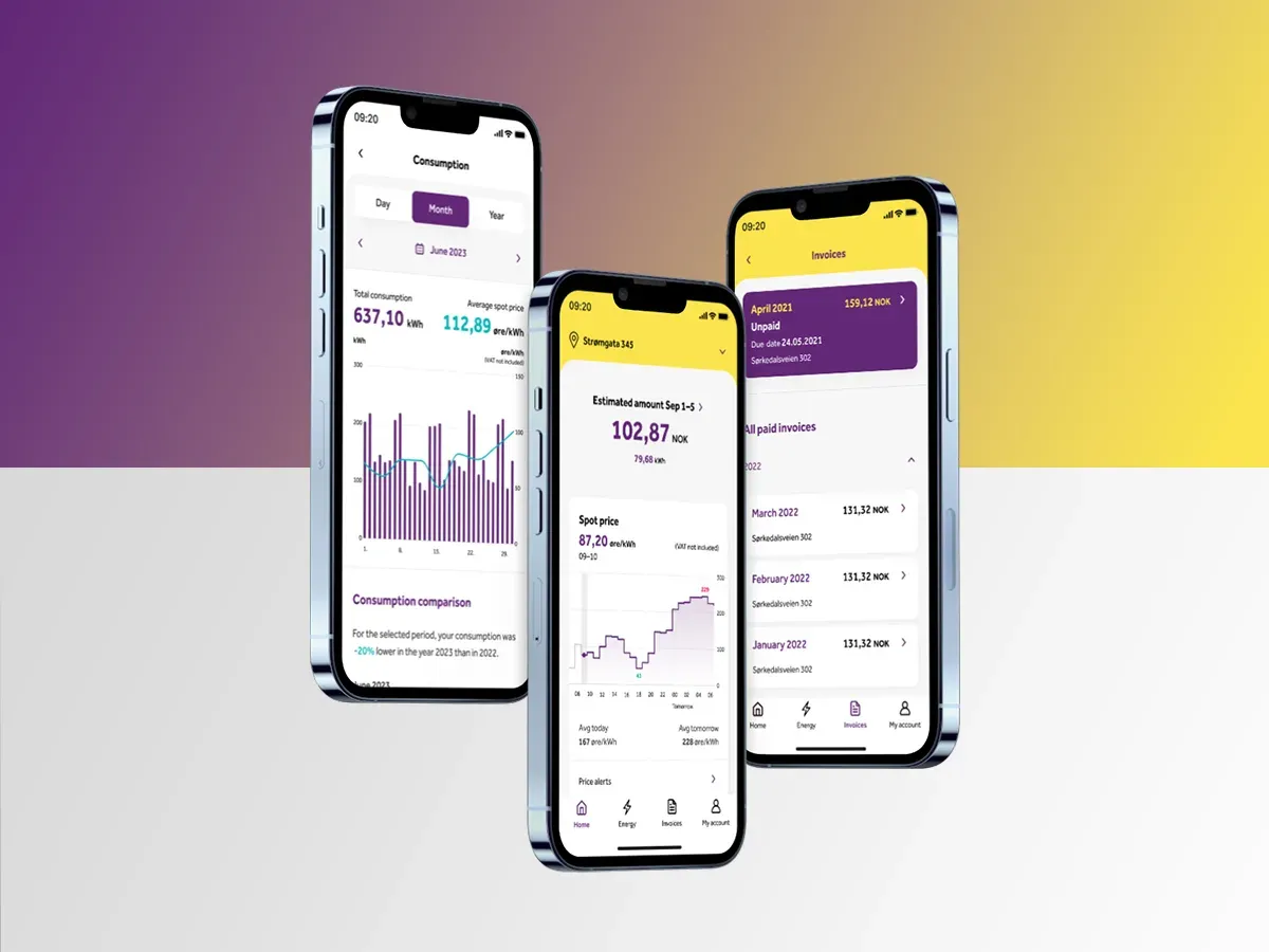
- 92%User satisfaction
- 45%Conversion
- -20%Drop-off
- 27%EngagementIncrease
Figures as reported by the programme.
On this page
Prices, use and bills in one app
The NorgesEnergi app delivers real-time energy prices and consumption, personalised to each user’s contract: live prices, current consumption, projected bills, and smart features such as scheduling EV charging and home heating around low prices.
I joined the app project as Senior UX Designer to research and improve the app for energy customers across Norway. I led several updates: spot price information, consumption data, invoices, the overall UX, and the update of the design system for NorgesEnergi mobile and web.
The team around the app: two other UX designers, a senior UI designer and a UI designer, a service designer, two tech leads, seven developers, a tester, an architect, a project owner and eight stakeholders from marketing, digital development, e-commerce and product.
Spot prices made invoices not enough
What was happening
- Spot prices. Consumers moved from fixed prices to spot prices, so viewing and paying invoices was no longer enough.
- New needs. People needed live prices, consumption tracking and cost estimates.
The opportunity
- Educate. Help users understand the energy market.
- Choose. Let them make informed choices, including EV charging.
Customers wanted prices, estimates and a way to act
We ran 4 surveys with 597 respondents and 102 interviews, 37 in person and 65 remote, and followed reviews, Facebook and Twitter. Participants were 17 to 55 and lived in metropolitan and suburban areas. They included first-time contract seekers, spot-price users, frequent movers, people cutting their consumption, and people with disabilities.
75% needed insights on prices
71% wanted estimated invoices
67% felt a strong need for a spot contract to cut their bills
66% wanted to learn more about daily prices
55% check their consumption daily and adjust
Four pain points
The app was uninformative, with no estimates, live prices or outlook. Energy apps were complex. They were unperceptive, with no actionable peak and off-peak insight. And they were unclear, with estimated costs hard to find.
Five steps, repeated
Show the processDesign journey
Five steps. Pick one to see what I did on NorgesEnergi.
102interviews, with 597 survey responses across 4 surveys
Surveys, interviews and platform shadowing. We also compared Tibber, Greenely and Motkraft on feature set, and on first impression, interaction, visual design and content.
- Interviews
- Surveys
- Observations
- Competitive audit
- Feature matrix
4pain points: uninformative, complex, unperceptive, unclear
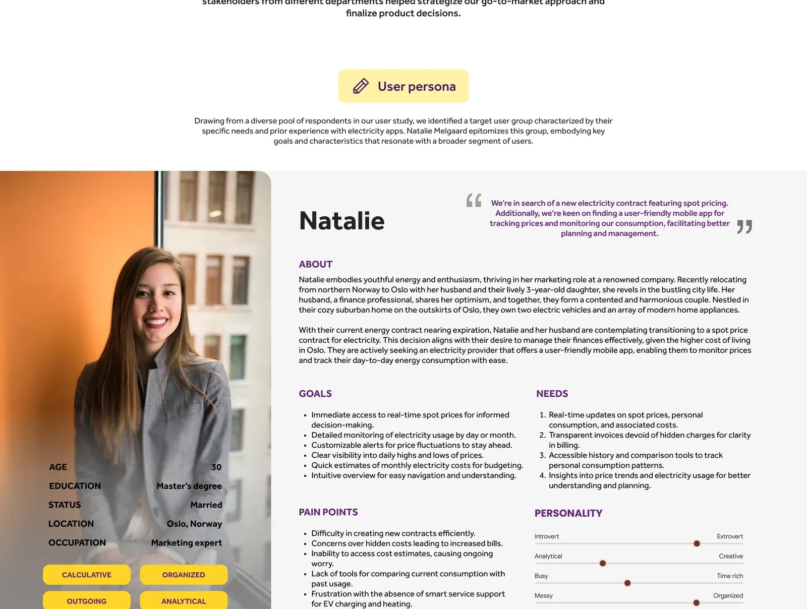
The findings became a persona: Natalie Melgaard, 30, a marketing expert newly moved to Oslo with her husband and 3-year-old, who owns two EVs and wants a spot contract with an app to monitor prices and consumption.
- AB tests
- Usability studies
- Surveys
- Journey maps
- Affinity maps
A value proposition and a prioritisation matrix of desirability against ease produced the MVP cut-off, along with a high-level architecture.
- Value proposition
- Prioritisation matrix
- High-level architecture
A rapid prototype was built to run a usability test, aimed at finding gaps, patterns and areas for improvement.
- Rapid prototype
- Usability test
2rounds of usability studies, then a refine phase
After two rounds of usability studies, the insights were gathered and prioritised, and refinements were made to the early design before the full build.
- Usability study
- Affinity mapping
- Insights
- Refine
The MVP
The prioritisation matrix set the cut-off. These features went into the first release:
- Estimated consumption and cost on launch
- An interactive daily spot price graph, with daily averages and high and low indicators
- Customisable price alerts
- Multiple contracts and addresses
- Invoice overview on the home screen
- Consumption breakdown by period, and comparison with past usage
- Language flexibility
- Clear agreement details
Three decisions that shaped it
What we chose, and what each choice cost.
Prices and estimates, not only invoices
- What we chose
- Add live spot prices, consumption and estimated invoices to the app.
- What it cost
- The app now had to explain the energy market, not just show a bill.
- What followed
- 75% needed insight on prices and 71% wanted estimated invoices.
Personalise to the contract
- What we chose
- Show each customer the prices, use and bills that match their own contract.
- What it cost
- More states to design, build and test than a single shared screen.
Let the app schedule around low prices
- What we chose
- Offer smart features such as scheduling EV charging and home heating around low prices.
- What it cost
- People hand the timing to the app, so the design had to keep prices and consumption visible.
Design system
Show the processDesign system
I led the update of the design system for NorgesEnergi mobile and web. It covers the bottom bar menu, content switcher, buttons, labels, date picker bottom sheet, chips, toasts, modal and notification cards. Press a colour to copy its value.
Typeface: Effra. The mobile type scale runs from Heading 0 to Heading 6, shown here in the site’s own type.
- Heading 040 px
- Heading 132 px
- Heading 229 px
- Heading 326 px
- Heading 424 px
- Heading 520 px
- Heading 618 px
Product walkthrough
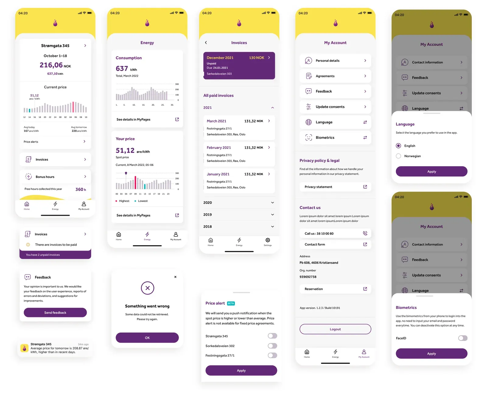
The production app, in the order people meet it. Press an image to open it full size, where the original notes are readable.
Login
Sign in with BankID, or with a user ID and password.
Home
Estimated consumption comes first, then the live spot price with an interactive graph and alerts, an invoice card, bonuses such as 360 free hours, and a cost card. Switching address is fast.
Energy
The estimated invoice, the ongoing price for spot or fixed contracts, a consumption overview, and consumption peaks, because peaks drive grid charges in Norway. A period toggle and date picker, a detailed graph against the spot price, and a comparison with the previous year.
Invoices
Unpaid invoices come first, then the history, with options to split or postpone a payment.
My account
Personal details, contract, language, consents, contact and moving.
In production
The app is on the iOS App Store and Google Play. Feedback came in through a webhook, and pain points were turned into improvements regularly.
- 4.5App Store rating3,652 reviews
- 4.0Google Play rating446 reviews
- 120,000+Active users at the peak
- 80%+Reported high satisfaction
What I took from it
What this taught me about the user
The research asked for information first. Automation, such as scheduling charging around low prices, sat on top of that.
- People trusted what they could see before they would let the app act.
- An estimate that is labelled as an estimate is more useful than a precise number that hides its basis.
Results
As reported by the programme: user satisfaction up from 50% to 92%, conversion from 22% to 45%, drop-off down 20% and engagement up 27%.
Churn was also reported as significantly reduced. The NorgesEnergi work then fed into the Fortum global app.